Artfolio
Art history apps tend to fall into one of two camps. Museum apps like Google Arts & Culture offer depth but rarely give people a reason to come back daily. Habit-driven apps like Duolingo nail the daily return but apply it to subjects with clearer right-and-wrong answers. Art history sits awkwardly between the two: it's a rich, interconnected subject, but most people experience it passively, scrolling past paintings without retaining much.
Artfolio's brief was to make this 600-year archive feel like something worth opening every day, on a phone screen, without dumbing it down.
Problem
Three things needed solving.
First, structure versus overwhelm. Movements overlap, artists belong to several schools, and works only make sense in context. Too simple and you lose what makes art interesting; too dense and a curious non-specialist switches off.
Second, no built-in motivation. There's no exam or deadline attached to learning art history : engagement has to come from the experience itself, not from gamification bolted on top.
Third, intimidation. Most users aren't art students. Many associate the subject with standing in a gallery nodding politely at things they don't fully get. The app needed to feel welcoming from the first screen.
Concept
The core idea: treat art history as a network rather than a list. Movements link to artists, artists link to works, works link back to movements and periods. The app is built around four pillars : Artists, Movements, Works, and Courses; all surfaced through a personalised Home feed.
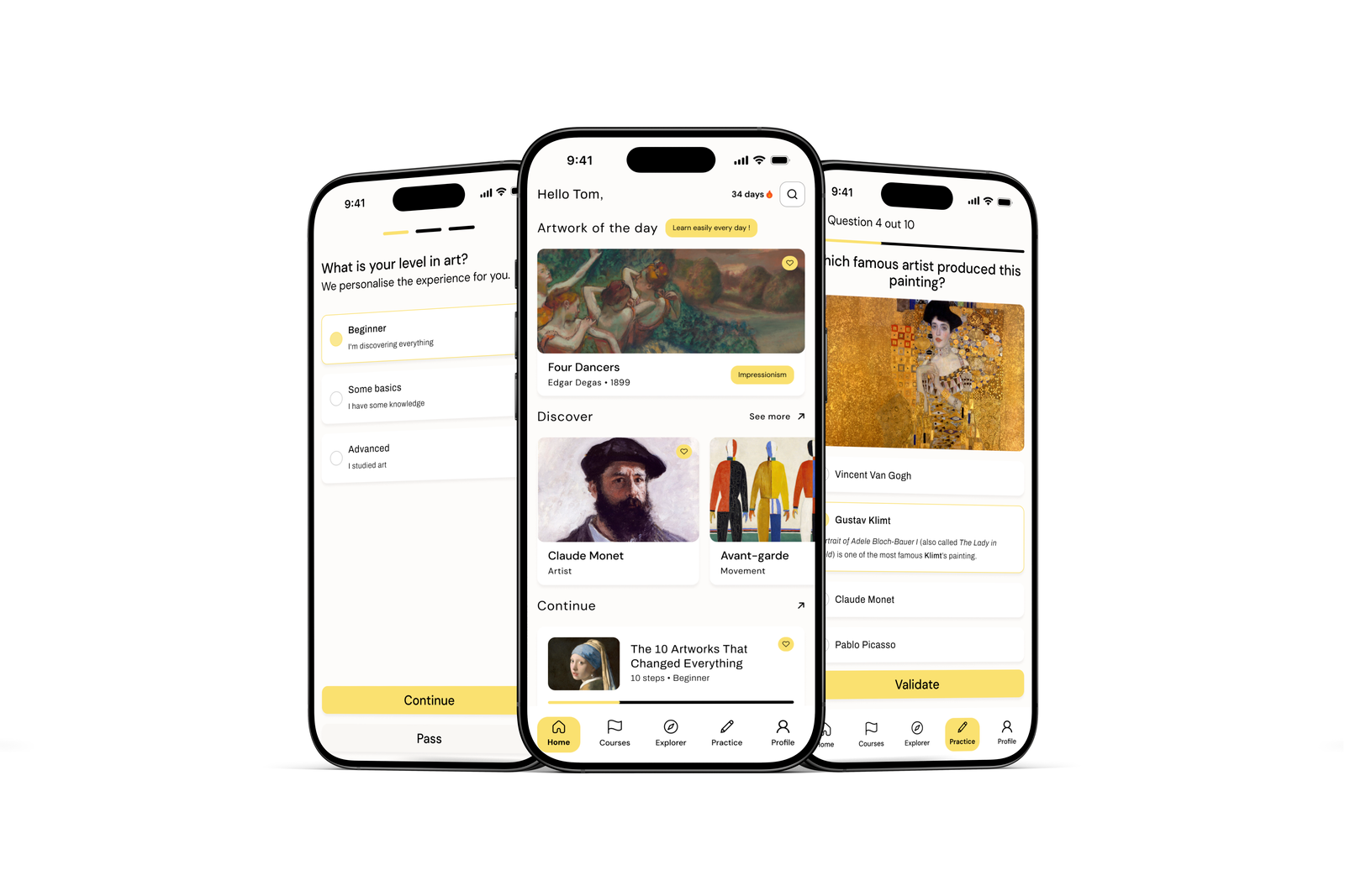
Onboarding sets the tone early: asking "What is your level in art?" (Beginner, Some basics, Advanced) isn't just personalisation, it signals from the first screen that the app will meet users where they are.
For motivation, Artfolio leans on familiar habit-app mechanics : a streak counter, a daily featured artwork, short structured courses ("7 Days to Understand Impressionism") but keeps the reward tied to the subject itself: a new painting, a new artist, a new connection, rather than abstract points.
Solution
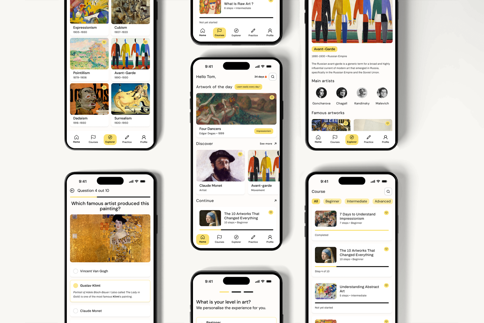
Home is the daily anchor. "Hello Tom" plus a 34-day streak creates routine at a glance. The "Artwork of the day" Degas's Four Dancers does double duty: a moment of visual pleasure, and a doorway into Impressionism if the user wants to go deeper. "Discover" and "Continue" sections below balance fresh content with picking up where you left off.
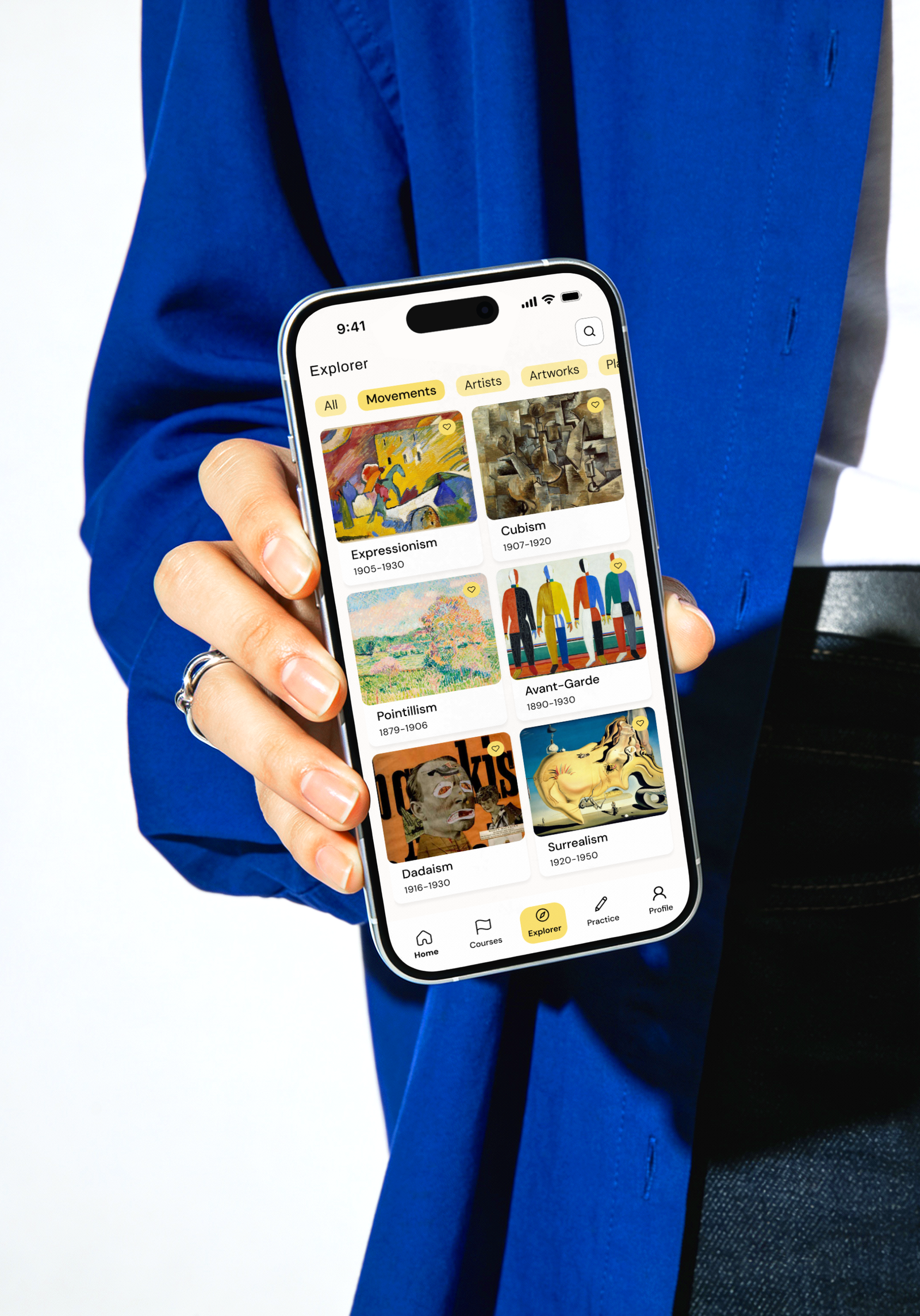
Explorer is where the depth lives. Movement cards show clear date ranges (Cubism 1907–1920, Surrealism 1920–1950) in a grid that mirrors the visual variety of the movements themselves. Tap into one : Avant-Garde, for instance, and you get a consistent pattern: hero image, short context paragraph, key artists (Goncharova, Chagall, Kandinsky, Malevich), then famous works. Learn this layout once and you can navigate any movement.
Courses give structure for users who want a path rather than free exploration : graded by level, with visible progress ("Completed", "Step 4 of 10"). That progress bar matters more than it looks: it gives an abstract subject a sense of momentum.
Practice turns recognition into recall. The quiz format ("Which famous artist produced this painting?") uses a recognisable work : Klimt's Portrait of Adele Bloch-Bauer I, with plausible wrong answers and a short explanation afterwards, reinforcing what's been seen elsewhere in the app.
Visually, the interface stays out of the way. Warm off-white background, a single yellow accent used sparingly for active states and highlights, restrained editorial typography so the art stays the focus. The bottom nav keeps all four pillars plus Profile within thumb's reach, treating discovery, learning, and testing as one continuous loop rather than separate modes.
Contact